Tag Archives: Lotta Jansdotter Fabric

Avenues

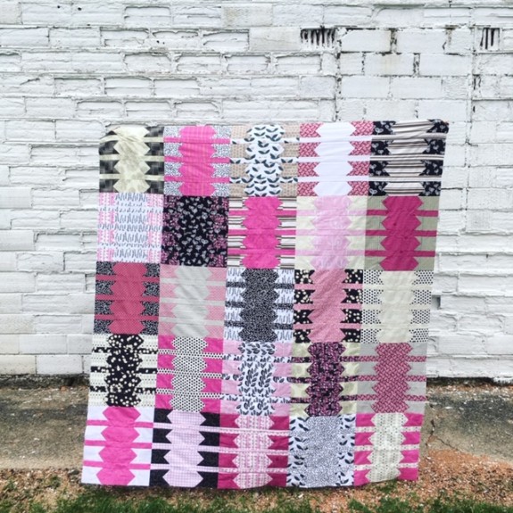
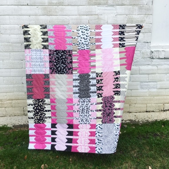
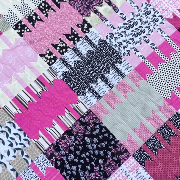
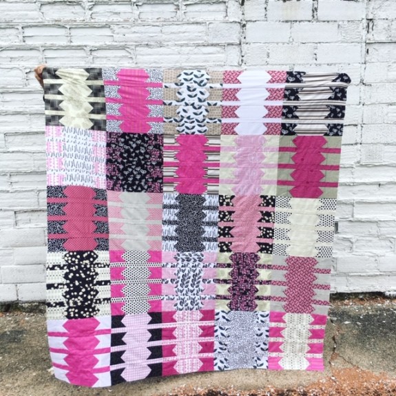
A while back I was doing some home décor shopping online and I saw a pillow on The Citizenry  that caught my attention.  I liked the pillow, but I liked the pattern on the pillow even more.  So much so that I thought it would make an interesting quilt block.  I decided to give it a try and this is what I came up with.
IMG_6187

I’m not sure how well the pattern translates into a quilt, but I’m a sucker for anything pink so I kind of like it.  Or at least I really like the fabrics I used.
IMG_6194

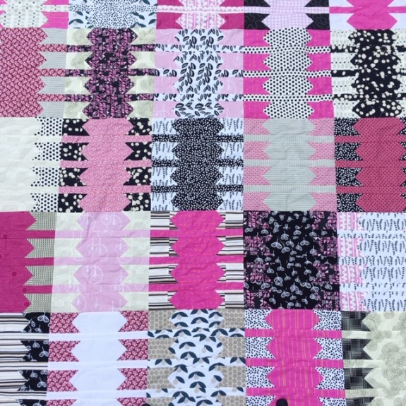
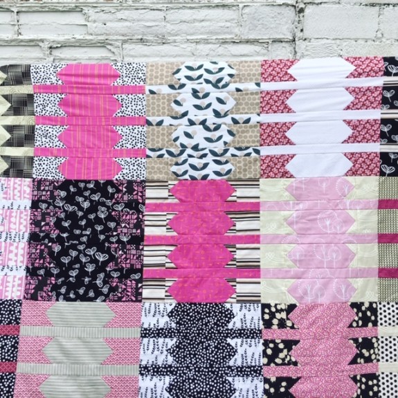
This is a combination of some of my favorites.  There is quite a bit of Lotta Jansdotter fabric; a little bit of Denyse Schmidt; some Cotton + Steel; a few pieces from Amy Butler; and then some random fabrics I had in my stash.
IMG_6192

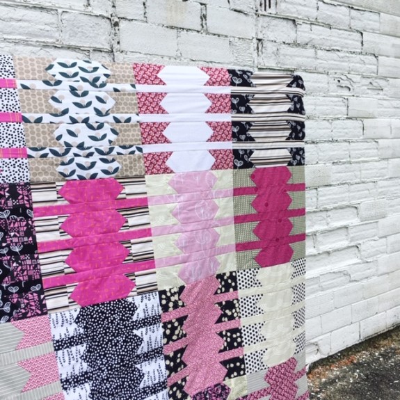
When I chose the colors, I knew I wanted to do something with pink, black and white, but I added in some purplish/pink colors, some grays and taupes, and some creamy whites.
IMG_6190

I wasn’t sure if mixing that many different shades of the same colors would work, but I think it does. Truthfully, though, the main reason I mixed them in was because I was short on fabric and needed to expand my color options.
IMG_6189

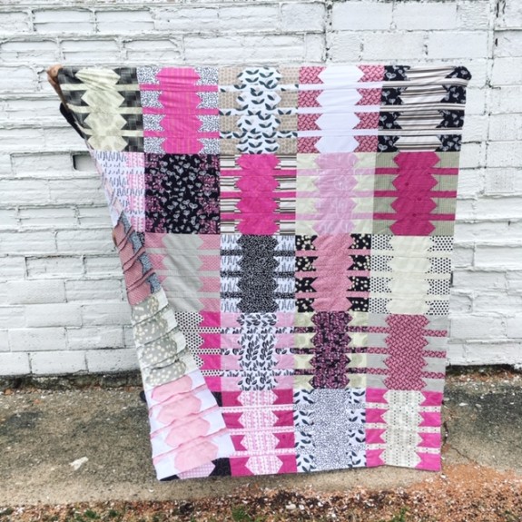
I think it would look good if I had stuck only to pink, black and white, but this might make it look a bit more interesting.
IMG_6191

For the quilt back, I’m sticking with the same color scheme and already have the back worked out.
IMG_6193

I’m already on to quilting this one so you may see the finished version sooner rather than later.
IMG_6188

Keep your eye out for the finished version.

A Whole Lot of Lotta

I’ve had this quilt top stashed away since the beginning of summer and thought I should probably write about it before the pictures are so outdated there is snow on the ground. On the other hand, maybe I should have saved it for the dead of January when we’re all dreaming of warmer weather.  But alas, here it is.

IMG_2207

This quilt is all Lotta Jansdotter fabric, minus some solid Kona Cotton black I used to finish it off. I was a bit short on fabric so I had to turn to my solid fabric stash to bring this one together.  I grouped the black fabric together (at an angle) instead of spreading it throughout the quilt, which I thought would make it too uniform looking.

IMG_2209

Originally, I planned to make an all black and white quilt using Lotta’s prints, but I had some pink fabrics of hers that I added in. I was trying very hard to stick to the black and white theme, but I kept eyeing the pink fabric so I finally gave in and went for it.

IMG_2208

I haven’t looked at this quilt since I made it a few months ago, but now that I am, I’m getting a bit of a 1950s Barbie vibe with the black, white and pink color combo. Anyone else seeing that too?

IMG_2210

This quilt is now going back into my pile of unfinished quilt tops and will stay there until I feel inspired to finish it off, which at the rate I’m going the past month, may take a while!

Fallingwater – Finished

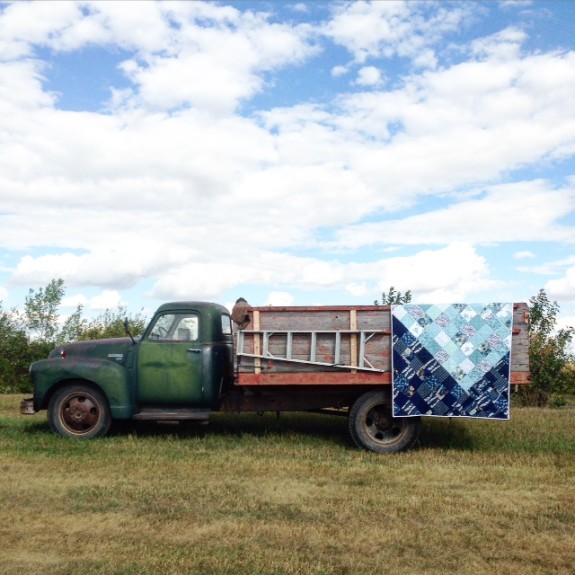
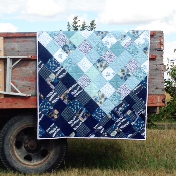
My Fallingwater quilt is done! This quilt uses the River Mist collection from Studio e Fabrics and Lotta Jansdotter’s collection for Jo-Ann Fabric – a perfect navy blue and aqua color combination.

IMG_2203

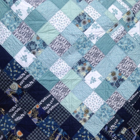
I kept this quilt pretty simple with some basic patchwork squares, but I wanted to switch it up a little with the placement of the squares; the result was a deep V pattern. I think it works pretty well and I like how the lighter aqua fabric falls into the darker blue fabric.

IMG_2204

IMG_2275

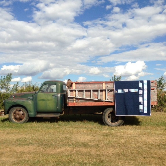
I used up every last bit of fabric for this quilt and pieced together what I had left for the back. I probably spent way too much time thinking about it, but I finally came up with something that I liked.

IMG_2205

I’m glad I did spend so much time on the back, because I think I like the back of this quilt more than the front! Has that ever happened to you? Along with the leftover scraps, I used Kona Cotton in Navy to bring it all together.

IMG_2206

If you look closely, you might notice a small amount of gold accents in the fabric. I took the gold accents as inspiration for the binding and used a gold polka dot fabric from my stash. After the back, my second favorite part of this quilt is the binding, but I’m a sucker for polka dots, metallic and otherwise.

IMG_2283

Like the Butterflies quilt I shared last week, this quilt was photographed at my aunt and uncle’s farm, which used to be my grandparents’ farm. The truck in the pictures belonged to my grandpa. Many years ago it was sold at an auction and has had a couple of different owners since. But my uncle recently tracked it down and bought it back. The truck is now back on the farm and is being used today. Pretty great story, huh?

I hope everyone has a wonderful holiday weekend and the only laboring you do is making quilts!

Lemonade Stand

Hello from my summer vacation! I’m spending some time out of New York and taking a four-stop vacation tour. I’m now heading into the last couple weeks of the trip and so far it’s been a nice break from hot and humid New York. Hurray for a little R&R!

But….even though I’m on vacation, I still have quilty things going on. Number one, of course, is to hit up as many fabric stores as I can. I’m happy to report I’m going strong on my fabric shopping spree. It’s been so fun to visit local fabric stores on my vacation route. When it’s all said and done, I’ll be sure to share all of my fabric finds; I’ve got some good ones.

I have also been busy snapping quilt pictures. I was scrambling to finish a few projects before I went out of town but I didn’t have a chance to take pictures of the finished quilts and quilt tops, so they came with me!

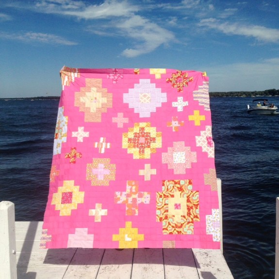
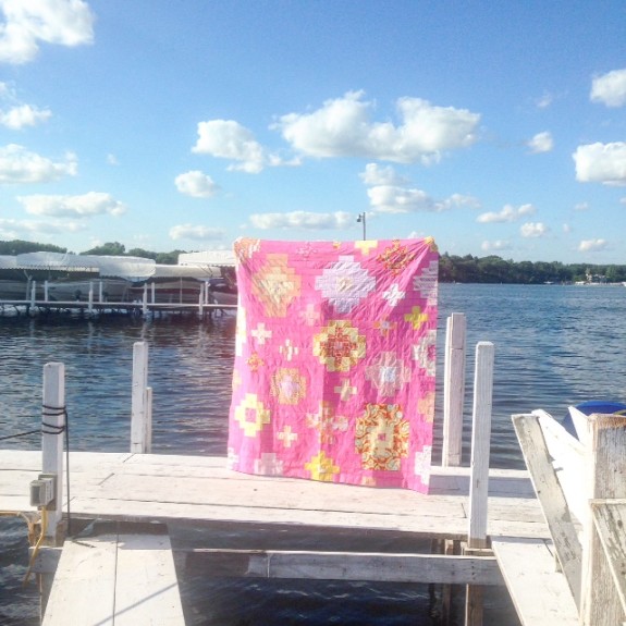
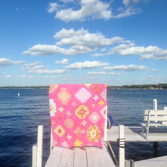
First up is my new Lemonade Stand quilt top.

IMG_1942

This quilt almost turned out how I imagined, except waaaay pinker. In my head this was a different shade of pink – something bold but not quite so bright. I’ve really been second-guessing my choice of pink fabric, but I’ve decided to embrace the bright pink and just go with it.

IMG_1945

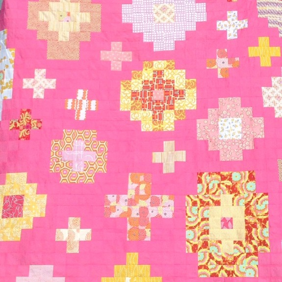
The good news is that I love the pattern.  That part of the quilt turned out exactly how I imagined.

IMG_1946

I’ve been thinking I might like using this pattern, or something similar, with all low volume prints. This might be a winter project I plan for.

IMG_1947

Most of the fabric in this quilt top is Lotta Jansdotter or Amy Butler. I really like the combination of pinks, oranges and yellows and think it gives it the perfect summer feel, which is what I was going for.

IMG_1943

That’s it for now. I have more quilt pics that I’ve taken on vacation coming up, so stay tuned!

P.S. This picture was taken at Lake Okoboji in Iowa while I was on the second leg of my trip. My parents live in Iowa and I spent my summers at the lake as a kid. I managed a couple of boat rides at Okoboji during my visit!

Fallingwater

Happy Sunday morning!  This morning, I’m sharing my new Fallingwater quilt top.  And yes, I’ve borrowed the name from the very famous Frank Lloyd Wright home, also called Fallingwater.  Every time I look at this quilt it’s the only name that comes to mind, so I’m sticking with it!

IMG_1496

Due to my lack of photography skills, the coloring in this quilt is slightly off.  The lighter part is kind of an aqua blue color, but in the photos it looks awfully gray.  When I finish quilting it and photograph it then, hopefully I can get that fixed.  But in the meantime I wanted to share what I have.

IMG_1499

This quilt is made with the River Mist collection from Studio E.  I’ve had the fabrics in my stash for over a year and the idea to use them, specifically the blue prints, finally struck.

004

I also mixed in some of the new Lotta Jansdotter prints from the collection she did with Jo-Ann’s.  I’m such a huge Lotta fan that I had to have them.  I love the prints and the colors work perfectly mixed with River Mist, but I have to say the fabric is quite thin.  I was a little surprised by that because normally when Jo-Ann’s offers a collection with a designer, the fabrics are much better quality than its lower-cost fabrics.  For example, I always pick up the Denyse Schmidt collections that arrive at Jo-Ann’s because I’m such a fan of Denyse as well, and I’ve never had a quality problem with her fabrics.  So fair warning if you plan to buy the Lotta Jansdotter collection from Jo-Ann’s.  Nonetheless, I still love the prints.

IMG_1502

The design for his quilt was largely determined by the fabrics.  I had more of the lighter color fabrics so they got more real estate in the quilt.  However, I wanted to do something more than a simple patchwork design, so I tried to make it interesting with the block layout.

IMG_1501

I added another little twist that’s hard to see in the pictures, but the blocks in the lower right corner and upper right corner are scrappy blocks.  Again, it adds a little more interest and also uses all of the fabric.  No scrap left behind!

IMG_1500

Side note about the pictures’ location: I took these pictures at the Boathouse in Prospect Park.  If you ever make it to Brooklyn, I highly recommend a swing through Prospect Park.  Yes, Central Park is beautiful and amazing and a wonderful place to go if you visit New York.  But those of us here in Brooklyn know we have our own gem of green space in Prospect Park, and the area around the Boathouse is especially magical.

IMG_1497

Next up I have to finish the back and quilt it.  I have a few scraps left that I’ll be sure to use in some kind of scrappy quilt back that I make for this.  I also have some larger solid Kona Cotton blues that I might try and use.  I’m not quite sure what direction I’ll go with that yet, but stay tuned.

Colorado Boy II

Happy Fall Sunday! It is a little chilly here in Brooklyn this morning, and I woke up to the familiar clanking of the radiator kicking in.  When you live in an old building in New York with radiator heat it’s either on at full force and feels like a sauna, or it’s off completely.  There’s no in-between, but I am enjoying the toasty feel of the heat this morning.  The joys of living in old buildings!

I’ve been a little busy the past couple of weeks doing non-quilting things – don’t you hate when that happens – but I have managed to finish the second Colorado Boy baby quilt.  I had enough fabric left from the first one to make a second quilt, so I did.

001

003

Of course it is slightly different, with the main difference being the back of the quilt. I didn’t take an image of the back, but the first one was blue and this one is gray.  After seeing both the blue and the gray, I like them both and don’t have a preference.

002

004

I’ll be putting this baby quilt up on my Etsy shop soon.  The goal is to get it listed today, but don’t hold me to it.  But I promise it will be there soon!

And finally in cuter news, I got my hands on a photo of the original Colorado Boy quilt in-use.  Meet Wyatt Mason chilling out on his quilt.

IMG_1324

Hope you have a great Sunday!

Colorado Boy – Finished

Last month I had a special request to make a baby boy quilt for a family in Colorado.  The only two design requirements were to make it a strip quilt and to use gray.  Easy enough!  This is what I came up with:

025

Since it is for a baby boy, I decided I had to throw in some blue, but rather than use bright blues I chose blues that are mostly a little darker and have some gray in them.  I did throw in the one shade of bright blue to add a little pop.

026

I think the different shades of blues and grays make for a very modern looking baby quilt.

032

And surprise!  There are two.

038

I had just enough fabric left to make a second quilt so it is currently in-progress.  The second one will be listed in my Etsy shop when it’s done.

039

The two are (of course) not exactly alike in the front or the back.  The baby quilt that is on its way to Colorado has a dark blue backing while the one for the Etsy shop will have a pale gray back.  I’ll let you know when the second one is finished!

Colorado Boy

I’m working on a baby quilt for a soon-to-be-born baby boy in Colorado.  Sometimes I find baby boy quilts more difficult to make because so much of the fabric available tends to be more girly looking, but I think I’ve found a good combination.  I’ve pulled some different patterns and shades of blues and grays for this one.

007

I’m kind of loving all of these fabrics and I can’t wait to see how it comes together.  More later.